
When I spotted Illamasqua 'Furore' on a blog sale a while ago, there was no way I couldn't break my 'no buy'. I'd heard nothing but good things about Illamasqua's pure pigments and of course, had to investigate them myself...

At first, I was worried that the lid (which is held on by nothing but a good fit) would slip off every time I picked it up - however, this is not the case, though I wouldn't feel confident to leave it to bounce around my make-up bag. I really like the unique packaging, especially having seen a few designs they passed on before settling on this sleek, elegant shape.

There is some information on the underneath of the pot, no ingredients, so I assume those are printed on the cardboard box the pure pigments are supplied in. At first I wasn't a fan of the sifter style, but without it can you imagine the mess the pot would be?!
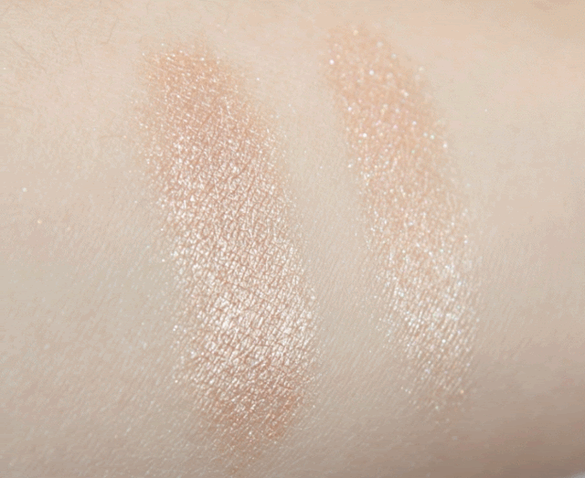
[[ Left: Illamasqua 'Furore' over fyrinnae pixie epoxy. Right: Over UDPP ]]
'Furore' is described by Illamasqua as a 'champagne peach shimmer', which I would say is bang on. In some lights it looks more bronze, in some more silver, in others more of a tan shade - very unique! I'd call 'Furore' a neutral shade, since the base in obviously quite warm, but the silvery shimmer adds a cooler twist. Lasts well over eyeshadow primer and eyeshadow bases though I'd recommend careful application to avoid fall out. I've been using 'Furore' wet as a lid colour, dry as a highlight and mixed with powder blush for a glowy finish.
Priced at £15.50 for 1.3g, maybe you'd find MAC pigments better value at £15.50 for 4.5g, but honestly - have you ever finished a full jar of pigment? I'd happily buy more Illamasqua pure pigments!
(P.S) Moving swatch pic - hit or miss?
LOVE the moving swatches. you get such a great idea of how it looks, as if it's infront of you. good work!
ReplyDeleteThis is a gorgeous colour. I absolutely love Illamasqua, and ADORE their Ore pigment.
I love the moving pics as well. I've seen them at their most effective when changing between different types of light as well, i.e a nail polish both in natural light and with a flash. It's so much nicer than scrolling through tons of pictures and trying to compare!
ReplyDeleteBig hit for the moving swatch pic :) I nearly always do swatches as .gifs!
ReplyDeleteFurore was my very first Illamasqua product, and remains one of my favourites :D
Love the moving swatch! Gorgeous everyday colour, too. I really need to try me some Illamasqua.
ReplyDeleteThe moving swatch is awesome! Such a great idea! It saves having to scroll down to compare the images :) thumbs up!
ReplyDeleteAnd loving the pigment too!
I think I've got the dreaded neutral-liking disease now, because I think this is really pretty.
ReplyDeleteBeautiful, I think I may need this. Leanne did tell me to get it. Why is she always right haha? I wouldn't have thought of using it in different ways like that. You're so resourceful! Loving the gif by the way :) xxx
ReplyDelete@ Jen W, glad it's useful! It's just annoying sometimes posting a still pic when the product looks ace in different lighting! Ore does look extremely tempting...
ReplyDelete@ Polish Mentalist, 100% agree! I love when glitter/ duochrome polish swatches are posted as moving pics.
@ Leanne, I bought it after seeing it swatched on your blog! Decided I needed it ahaha.
@ Robyn, yes you do need some Illamasqua :P
@ unleash_the_bats, goodo! Tis a pretty pigment :)
@ Julianne, ahaha, welcome to the club :S I've been into neutrals lately, too!
@ Kim, haha, Leanne knows best! I think it's easiest to think of ways to use things when you just think of them as a 'powder'/ 'pigment'/ cream' instead of their product name.